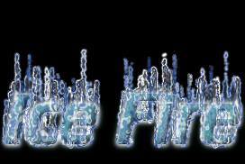
How did we make this image?
29th October 2010:
- Fixed problem with Highlight Animation when blur is zero it would fail.
- Fixed a few small layout issues.
28th October 2010:
- The font picker will now remember the "Auto Close" checkbox. If you turn off the Auto Close, then when you pick fonts in the font picker, it will show you the logo preview while you are browsing different font styles. Give it a go, it's cool!
- The color picker is now more obvious, and the extra color picker has been removed for all modern browsers.
27th October 2010:
- Added the new font picker. Now just click on the font, and a window will display giving you various ways to select the the font.
- Added the Virtual Keyboard to make it easier to add characters from other languages. Try it by hitting the
 image on the logo page.
26th October 2010:
- Upgraded Round Button to have much nicer transparency, added background color and save as different file types.
25th October 2010

Try this logo with different gradients, and also try reducing and increasing the "Smoothing" parameter to see how it gives the logo extra height.
24th October 2010:
Upgraded
Old Photo Logo
Advanced Text options and save as different file types.
23rd October 2010:
Upgraded
Pattern Shadow
Advanced Text options and save as different file types.
22nd October 2010:
Upgraded
Bovinated
to include transparency, Advanced Text options and save as different file types.
21st October 2010:
Upgraded
Textured
to include Advanced Text options and save as different file types.
20th October 2010:
Upgraded
USA
and
Horizon
to include Advanced Text options and save as different file types.
19th October 2010:
- How's your Mandarin? Our's is excellent! Check it out even if you don't speak Mandarin, it looks cool...
- Fixed issue with mailing images to yourself or a friend.
- Fixed issue with forgot password.
18th October 2010

Try this logo with different "Fill with:" properties. Gradient and pattern also look excellent.
17th October 2010:
16th October 2010:
Upgraded
Whirl Pinch
to include Advanced Text options, and it's nicer looking now too.
15th October 2010:
- Upgraded Shake and Jump to include Advanced Text options.
- Added "Grow Size" to Advanced Text options. This allows you to make thin fonts a little bolder. For example, if you are using i-text or outline shadow, the effect doesn't work very well on thin fonts (eg bodoni), so try setting the growSize in the range 1-4.
14th October 2010:
Upgraded
Burn In Anim
to include Advanced Text options and make it more obvious what the options mean.
13th October 2010:
Upgraded
Frosty
to include Advanced Text options and to save as different file types.
12th October 2010:
Upgraded
Starscape
to include Advanced Text options and to save as different file types.
11th October 2010

Logotipo Degradado3 This is a very interesting style. Based on Gradient Shadow, this logo can be modified in lots of different ways to get different effects. In particularly, try changing the gradient, the Gradient Type, and the Gradient Repeat. Some of these are a little technical, but play around to get a CoolLogo!
10th October 2010:
Upgraded
Starscape
to include Advanced Text options and to save as different file types.
9th October 2010:
Upgraded
Woodgrain
to include Advanced Text options.
8th October 2010:
Upgraded
Gradient Shadow
to include Advanced Text options and to save as different file types.
7th October 2010:
Upgraded
Comic Book
to include Advanced Text options and to save as different file types.
6th October 2010:
Upgraded
Cool Metal
to include Advanced Text options and to save as different file types.
5th October 2010:
Upgraded
Electric and
Glossy
to include Advanced Text options and to save as different file types.
4th October 2010

Logotipo con Fuego Helado
27th September 2010

Logotipo de Reflejo Animado
21st September 2010
- How's your Hindi? Our's is excellent.
20th September 2010

Logotipo con Electricidad
19th September 2010
- Updated the menu system to be easier to use, and to give previews.
17th September 2010
- Fixed Author Name/URL sometimes missing from bottom of logo pages.
16th September 2010
- Fixed SF Ballons Thin font for scripts like Party Logo.
- Fixed the Popular font BadAcid.
13th September 2010

12th September 2010
- Fixed Font picker that was broken for some users. Sorry for the inconvenience, but thanks to all those that reported the problem.
- GreyMan - added advanced text options, and save As Options.
- Blood Logo and Double Outline Logo now have Advanced Text options, and Save As options
11th September 2010
- Carved Logo and Crystal Logo now have Advanced Text options, and Save As options
10th September 2010
- Fix for Oil Spill (I broke it yesterday, sorry about that).
- Gimp.org Logo now has full Shadow options, transparency option, advanced text properties, and ability to save to different formats.
- Steel Logo has the Advanced Text options.
- Advanced Text Options.
- Text Border is the extra space around the text for your logo.
- Antialias should almost always be on, but without fonts will look more jaggy (pixelated).
- Hinting should also always be on, and this will try and line the letters up on pixel boundaries.
- Letter Spacing is the extra space between the letters, and
- Line Spacing is the extra space between two lines of text.
9th September 2010
- Wood Logo and Beveled Logo have been improved to include a Drop Shadow, and the advanced Text Properties
- Blended Logo has been improved to include better defaults, and more options as to how the gradient is blended. Blend Mode 0 is Start Color to End Color in RGB space (normal). 1 is in HSV space. 2 is Start Color to Transparent. 3 is using the Gradient.
8th September 2010
- Bovinated Logo has been improved to include Spot Density, Advanced Text properties, and option to save in different formats.
- Mosaic Logo has been improved so that it doesn't contain funny edges. It has been enhanced to include the Advanced Text properties.
7th September 2010
- Improved Russian site.
- Old Stone Logo now has transparency option.
- Flaming Text Logo, and Blue Fire have a large number of new options. You can now specify the Angle. 0 points up, 90 is right, 180 down, etc.. If you click on the Advanced options in Logo Properties, then you can adjust frame properties, flame characteristics and flame height. Frame Rate is the time in milli seconds between frames. Frames is the number of frames in the loop. The more frames, the more realistic, but the generated file is large (in bytes). If you increase the frames, then you'll want to increase the p-frames and o-frames to really get a nice looking fire. Distance adjusts the height of the flame. If the flame "wraps", then include the Text Border in the Advanced Text properties.
- Neon Logo now has transparency option.
- Enhancements and fixes for IE6 browser. Yes we care :)
6th September 2010
